New Gmail Interface for iPad
Friday, November 15, 2013
0
comments

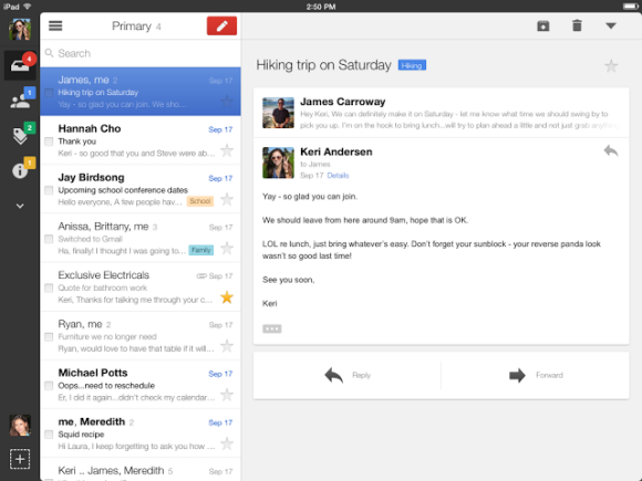
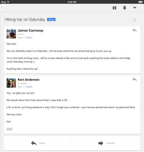
The sidebar that displays the messages from the current view is now hidden in the portrait mode, so you can better read your mail. You need to tap the three dot icon to see the list of messages, but you can also swipe from the left edge. The built-in mail client from iOS also hides the messages list in portrait mode.

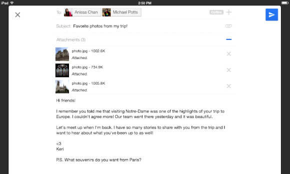
There's also a full-screen compose box, so you get more room to write your messages.

Google mentions some other improvements: a better scrolling experience and some iOS7 features like the new keyboard.
The new Gmail for iPad has a lot in common with the updated Google Drive app for iPad. Google spends a lot of resources to make its UIs more consistent, so I wouldn't be surprised to see these interfaces added to the desktop.
{ via Gmail Blog }
TERIMA KASIH ATAS KUNJUNGAN SAUDARA
Judul: New Gmail Interface for iPad
Ditulis oleh muamar
Rating Blog 5 dari 5
Semoga artikel ini bermanfaat bagi saudara. Jika ingin mengutip, baik itu sebagian atau keseluruhan dari isi artikel ini harap menyertakan link dofollow ke https://androidmobile7.blogspot.com/2013/11/new-gmail-interface-for-ipad.html. Terima kasih sudah singgah membaca artikel ini.Ditulis oleh muamar
Rating Blog 5 dari 5


0 comments:
Post a Comment