More About Gmail's New Attachment UI
Thursday, November 21, 2013
0
comments
Here are some of my favorite features:
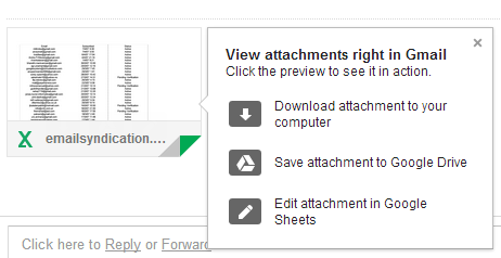
1. Thumbnails - they're displayed for many files, not just for photos. They help you distinguish between attachments and they're especially useful for PDF files, presentations and photos.

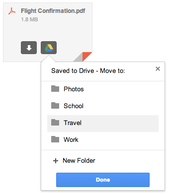
2. Save to Drive - mouse over an attachments, click "save to drive" and you can select the Drive folder where to save the file. You no longer have to visit Google Drive to move the file. Please note that the file is automatically saved to Google Drive and selecting a folder is optional.

3. Save all to Drive - if a message has more than one attachment, you can save all the files to Google Drive with one click. You only need to find the Drive button placed next to the attachments. You can also click "download all" to download a ZIP file with all the attachments.

4. Show in Drive - Gmail is smart to remember when you save a file to Google Drive and replaces "save to Drive" with "show in Drive", which opens the file in Google Drive. "Save all to drive" is disabled after clicking the button once.
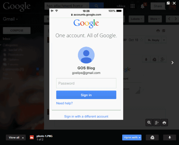
5. Quick preview - just click an attachment and you can preview the file inside Gmail. This works for photos, PDF files, documents, spreadsheets, presentations and more. To scroll down, use the mouse wheel, the down arrow key or Page Down. You can click the "pop out" icon next to "x" to open the preview in a new tab. To close the preview box, press Esc or click the "x" icon.

6. Slideshow - you can quickly go to the next attachment by clicking the arrow icon or by using keyboard shortcuts (right arrow key). Use the left arrow key to go back to the previous attachment. This is only a manual slideshow, there's no support for automatic slideshows.
7. Share photos on Google+ - click the attachment, then click the Google+ button at the bottom of the page. For multiple image attachments, click the Google+ button next to the list of attachments and you can share all the images on Google+.
8. Print files - click the attachment, then click the "print" button at the bottom of the page.
9. Zoom in/zoom out/zoom to fit - use the zoom buttons for a more in-depth look.
10. Edit files - for files you can import in Google's Drive apps, you'll also see a button like this when you mouse over the attachment: "Edit in Google Sheets", "Edit in Google Docs" or "Edit in Google Slides". Click the button to save the attachment as an editable file.
When you preview the file, you can click "Open with" and select an app that handles your file. This is not limited to Google's apps, so you can select apps like Zoho, DocuSign and more.
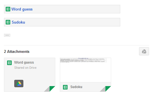
Oh, and one more thing: links to Google Drive files are treated as attachments.

While the new interface is great, I found a some annoyances. There's a cool feature that is no longer available in the new interface: it allowed to see all the image attachments on a single page. Another downside is that you need to mouse over an attachment to see the entire filename and its size.
{ Thanks, Stefan. }
TERIMA KASIH ATAS KUNJUNGAN SAUDARA
Judul: More About Gmail's New Attachment UI
Ditulis oleh muamar
Rating Blog 5 dari 5
Semoga artikel ini bermanfaat bagi saudara. Jika ingin mengutip, baik itu sebagian atau keseluruhan dari isi artikel ini harap menyertakan link dofollow ke https://androidmobile7.blogspot.com/2013/11/more-about-gmail-new-attachment-ui.html. Terima kasih sudah singgah membaca artikel ini.Ditulis oleh muamar
Rating Blog 5 dari 5


0 comments:
Post a Comment